Global introduces new logo and strapline for Smooth Radio

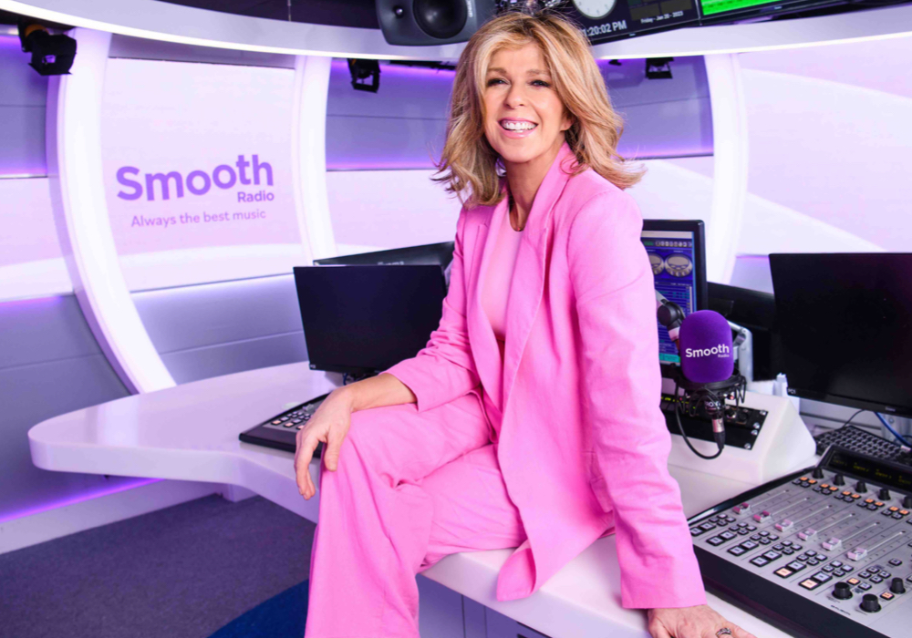
Smooth Radio has been given a ‘brand refresh’ with a new logo and strapline introduced.
The new logo is an evolutionary upgrade on the design used for the last ten years, keeping a similar font but changing the shape and colours surrounding it.
The word Radio has also moved from the left side to the right side.
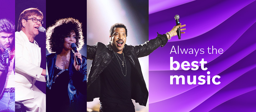
A new strapline has also been brought in, replacing Your Relaxing Music Mix with Always The Best Music.
Since launching in 2004, Smooth has used four different logos, all with a similar style, giving the network continuity in its branding.
When asked about the changes, a Global spokesperson told RadioToday: “Our new strapline, ‘Always the best music’ recognises that Smooth is packed with the best music from iconic artists across the decades.
“The new visual identity is fresh and modern, moving on from the strong purple to a cleaner, brighter look and feel.”
In the latest RAJAR, Smooth Radio was the UK’s third largest commercial radio station (behind Heart and Capital), with 5.6 million weekly listeners, adding 123,000 listeners in the previous quarter.
Kate Garraway hosts the biggest show on the station, with 2.2m tuning in each week.
When @SmoothRadio wakes up like it’s had fresh trim, slipped on a new outfit and really getting into 2023! pic.twitter.com/iu81FKVdhe
— Keith True (@KeithTrue) January 26, 2023
I love how it has evolved over almost 20 years! pic.twitter.com/9p43juvmB1
— Roy Martin (@roymartin) January 25, 2023

